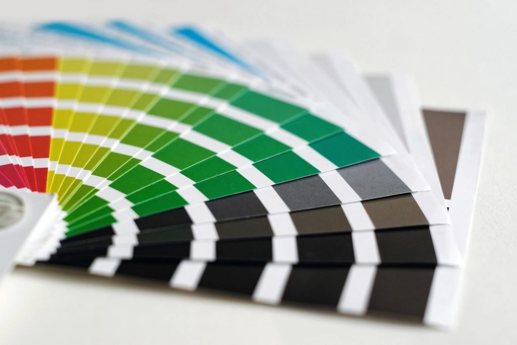
Some color combinations just look right, and others feel off, even to someone with no design training — that instinct is tracking real relationships on the color wheel, not just random taste.
Common Color Harmony Types
- Complementary: colors opposite each other on the color wheel — high contrast, energetic
- Analogous: colors next to each other — harmonious, calm, low contrast
- Triadic: three colors evenly spaced around the wheel — vibrant but balanced
- Monochromatic: variations in lightness/saturation of a single hue — cohesive, safe
Why Contrast Matters Beyond Aesthetics
Building a Practical Palette
Most real designs need more than an aesthetic pairing — a primary color, a secondary/accent color, and neutral tones (for backgrounds and text) cover most of what a website or brand actually needs, rather than a handful of colors with no clear role.
Starting From a Single Color
Generating a palette from one brand or seed color keeps the whole set cohesive, since every color is mathematically related to that starting hue — a faster and more consistent starting point than picking several colors independently and hoping they work together.
Worked Example: A Palette for a Small Website
Starting from a single brand color — a teal such as #0F4C57 — a practical website palette might look like this:
- Primary: teal #0F4C57 for the header, links and main buttons.
- Accent: a warm orange such as #F2994A (roughly complementary to teal) used sparingly for highlights and calls to action.
- Light neutral: an off-white such as #F7F9FA for backgrounds.
- Dark neutral: a near-black such as #1F2933 for body text.
A useful rule of thumb for balance is 60-30-10: about 60% neutral background, 30% primary color and 10% accent.
Checking Contrast
The Web Content Accessibility Guidelines (WCAG) recommend a contrast ratio of at least 4.5:1 for normal body text and 3:1 for large text (roughly 24 px, or about 19 px bold). Dark text on a light background, or white text on a dark primary color, usually passes easily. Light grey text on white, and bright yellow on white, are common failures.
Common Mistakes to Avoid
- Too many strong colors. If everything stands out, nothing does — keep bold colors for what matters.
- Relying on color alone to show meaning (like red for errors); add icons or text for people with color blindness.
- Forgetting dark mode. Colors that look good on white may need lighter or softer versions on a dark background.
Frequently Asked Questions
How many colors should a brand palette have?
Most brands work well with one or two main colors, one accent, and two or three neutrals. More than that becomes hard to use consistently.
What do HEX codes mean?
A HEX code like #0F4C57 describes a color with three pairs of values for red, green and blue, each from 00 to FF. It's the standard way to specify colors on the web.
See it with your own figures
Use our free Color Palette Generator — harmonious palettes in seconds
Open Color Palette Generator →